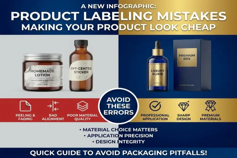
You poured months into your product. The formula, the sourcing, the packaging concept, all of it mattered to you. Then it sits on a shelf next to a competitor, and shoppers walk right past it.
Here’s the uncomfortable truth: most product labeling mistakes aren’t about the product at all. They’re about a label that quietly tells customers, “this brand isn’t ready yet.” And shoppers decide that in under three seconds.
The good news? Every one of these label design errors is fixable. Below are the 7 most common labeling mistakes we see, and exactly how to correct them before they cost you another sale.
1. Inconsistent Branding and Color Mismatches
Nothing says “amateur” faster than a label whose colors don’t match your logo, your website, or your other packaging. When your blue on the bottle isn’t the same blue on your Instagram page, customers register that mismatch, even if they can’t explain why something feels off.
Why This Happens
Most brands design labels in RGB (screen colors) without converting to CMYK or Pantone for print. Screens and printers render color differently, so what looked perfect on your laptop can shift, dull, or warp once it hits the press.
The Fix
- Lock in your brand colors using Pantone color matching, not just RGB hex codes
- Request a physical proof before a full print run
- Keep a brand style guide so every product, label, and box stays visually consistent
2. Blurry, Pixelated, or Low-Resolution Graphics
A fuzzy logo or stretched image is one of the fastest ways to erase customer trust. If your label looks like it was printed from a phone screenshot, shoppers assume your product quality matches.
Why This Happens
Logos and images pulled from websites or social media are usually 72 DPI, which is fine for screens, but disastrous for print. Labels need a minimum of 300 DPI to stay crisp.
The Fix
- Always design or supply files at 300 DPI or higher
- Use vector files (AI, EPS, PDF) for logos whenever possible
- Never stretch or enlarge a small image to fit a bigger label; resize the design, not the image
3. Cluttered Layouts With No Visual Hierarchy
When everything on a label is shouting for attention, bold text, five fonts, three colors, a burst graphic, and a paragraph of copy, nothing stands out. The eye doesn’t know where to land, so it moves on to the next product.
Why This Happens
Founders often try to cram every selling point onto the label at once: certifications, taglines, ingredients, awards, and social handles. More information starts to feel like more value, but it backfires.
The Fix
- Establish a clear visual hierarchy: brand name first, key benefit second, supporting details last
- Use white space deliberately; empty space isn’t wasted space, it’s what makes the important parts pop
- Limit your label to one focal point per panel
4. Illegible or Mismatched Fonts
If a customer has to squint, tilt the bottle, or guess what your label says, you’ve already lost them. Decorative script fonts might look elegant in a design mockup, but at real-world label size, they often become unreadable.
Common Font Mistakes
- Using more than two or three font families on one label
- Thin, light-weight fonts on small text, like net weight or ingredients
- Low contrast, such as light grey text on a white background
The Fix
- Choose one display font for branding and one clean, simple font for body copy
- Test legibility by printing the label at actual size, not just viewing it zoomed in on a screen
- Keep font color and background contrast high enough to read from arm’s length
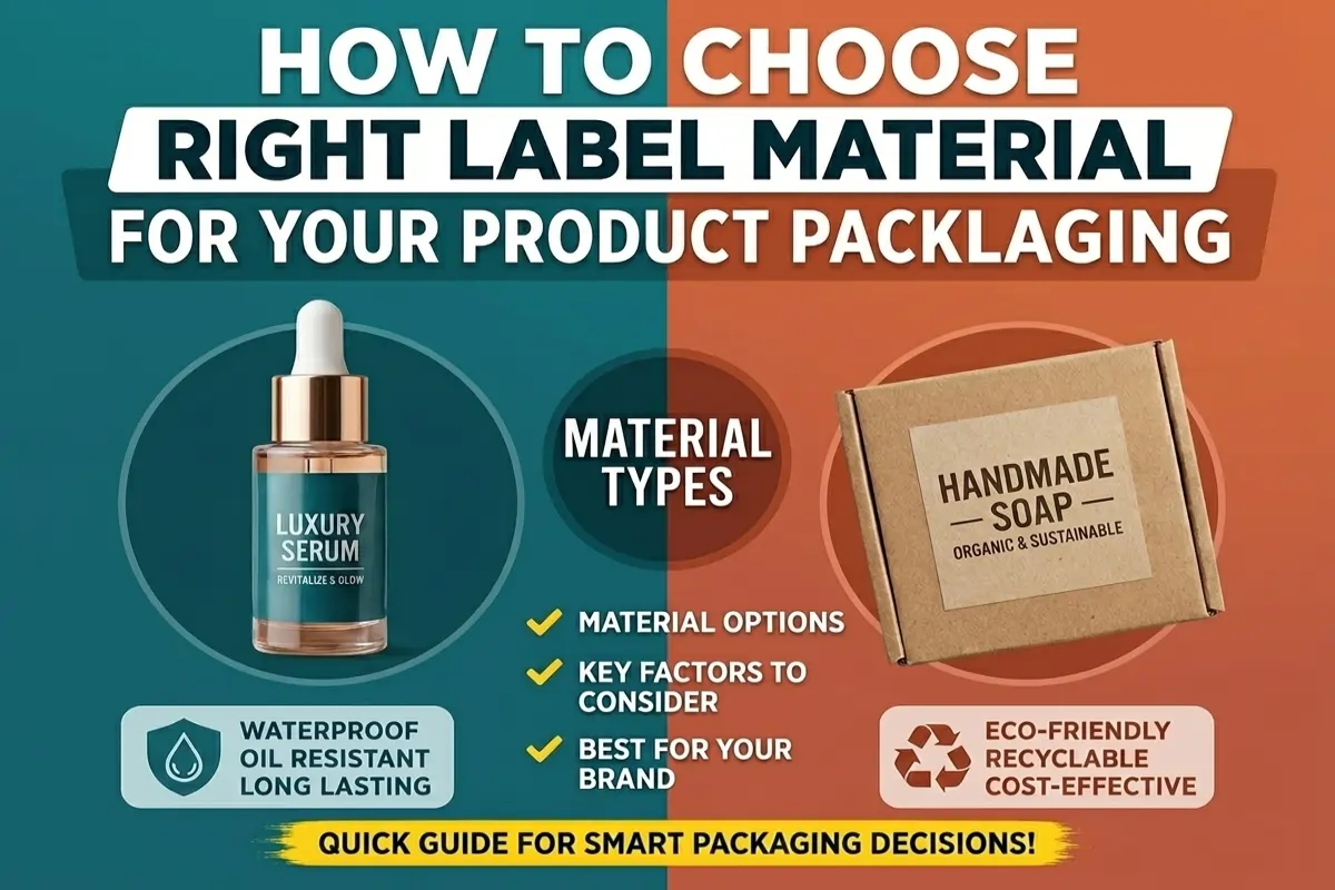
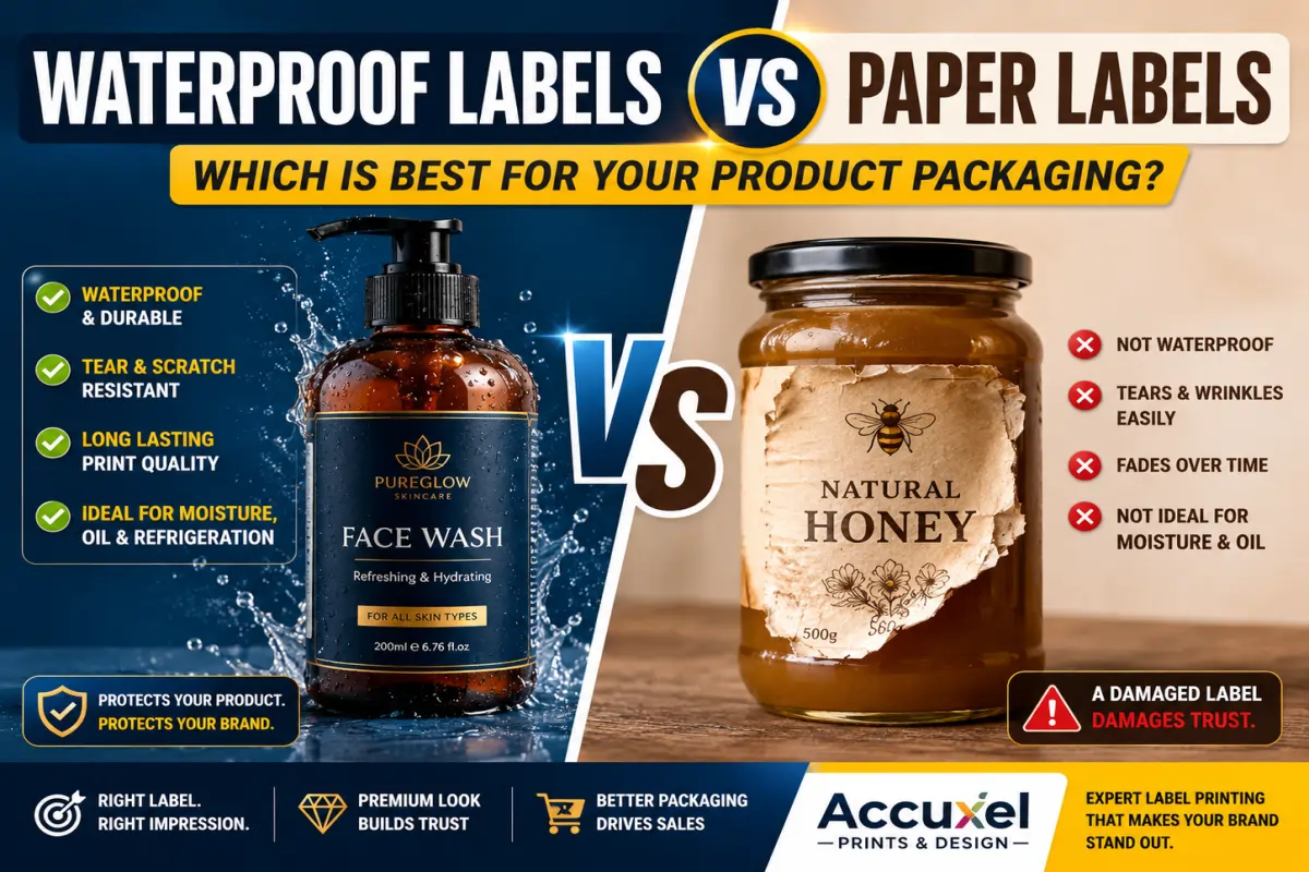
5. Using the Wrong Label Material or Finish
A beautiful design can still fail if it’s printed on the wrong label substrate. Paper labels on a product that lives in a fridge, freezer, or shower will wrinkle, peel, or fade within days, and a damaged label reads as a damaged brand.
Signs You Have the Wrong Material
- Labels peeling at the edges after handling
- Ink smearing when the product gets wet or oily
- Faded color after a few weeks of light exposure
The Fix
| Product Type | Recommended Label Solution |
|---|---|
| Cold or wet storage (drinks, skincare) | Waterproof vinyl labels with lamination |
| Pantry or dry goods | Matte or gloss paper labels |
| Outdoor or industrial use | UV-resistant, weatherproof vinyl |
| Premium or gift products | Foil stamping or embossing for tactile shelf appeal |
Choosing the right finish isn’t just cosmetic, it’s about durability matching the product’s real environment.
6. Missing or Misplaced Required Information
This mistake doesn’t just look unprofessional; it can get your product pulled from shelves or flagged by retailers. Net weight, ingredient lists, barcodes, and batch codes aren’t optional design elements; they’re packaging compliance requirements.
What Often Gets Missed
- Barcode placement too close to a label edge or curve, making it unscannable
- Ingredient or nutrition panels in text too small to legally pass review
- No batch/lot code, which retailers and regulators may require for traceability
The Fix
- Build a compliance checklist specific to your industry (food, cosmetics, supplements all differ)
- Confirm barcode placement and scannability before mass production
- Work with a label printing partner who understands regulatory labeling requirements, not just design
7. Ignoring Bleed, Dieline, and Print-Ready File Specs
This is the mistake almost no one outside the printing industry knows to look for, and it’s one of the most common reasons labels come back from print looking wrong. Text gets cut off. Colors don’t reach the edge. The label sits crooked on the bottle.
Why This Happens
Designers (especially DIY founders using free design tools) often build labels without bleed lines, registration marks, or an accurate dieline, the template that defines exactly where the label will be cut and folded.
The Fix
- Always design with proper bleed (typically 0.0625″ – 0.125″ beyond the cut line)
- Request the exact dieline from your label printer before finalizing the design
- Send print-ready files in CMYK, not RGB, to avoid last-minute color shifts
Final Thoughts: Your Label Is Your First Sales Pitch
Every one of these common labeling mistakes shares the same root cause: treating the label as an afterthought instead of a strategic part of the product. Customers don’t read your business plan or taste-test your product before deciding whether to trust you. They read your label. In seconds, it tells them whether you’re a serious brand or a shortcut.
The shift from “looks homemade” to “looks like it belongs on a premium shelf” almost never requires a bigger budget. It requires the right files, the right materials, and a print partner who catches the details before they become expensive mistakes.
Quick Recap: 7 Mistakes to Avoid
- Inconsistent brand colors
- Low-resolution, blurry graphics
- Cluttered layouts with no hierarchy
- Illegible or mismatched fonts
- Wrong label material for the product
- Missing or misplaced required information
- Ignoring bleed, dieline, and print-ready specs
Ready to Fix Your Labels for Good?
You don’t have to catch every one of these label design errors alone; that’s exactly what a packaging printing partner is for. At Accuxel Prints and Design, we review your files for print-readiness, match your brand colors precisely, and recommend the right material and finish for how your product is actually used and stored.
If your label has been holding your product back, let’s change that. Reach out to Accuxel Prints and Design today for a free label review, and let’s get your packaging looking as professional as the product inside it.